Bet on Black was born out of the need to level the playing field in capital funding, addressing the significant disparities that limit Black entrepreneurs despite their growing influence and potential.
SUMMARY
CREATIVE LEAD
ROLE
ART DIRECTION
CONCEPTUAL IDEATION
CROSS-BRAND INTEGRATION
PRE/POST-PRODUCTION FEEDBACK
INPUT
REVOLT
TARGET
PARTNERS
THE CHALLENGE
Black founders receive less than 2% of venture capital funding, despite Black women being the fastest-growing group of entrepreneurs. At the same time, 60% of Black adults believe that supporting Black-owned businesses is one of the most effective strategies for advancing the Black community.
THE PROBLEM
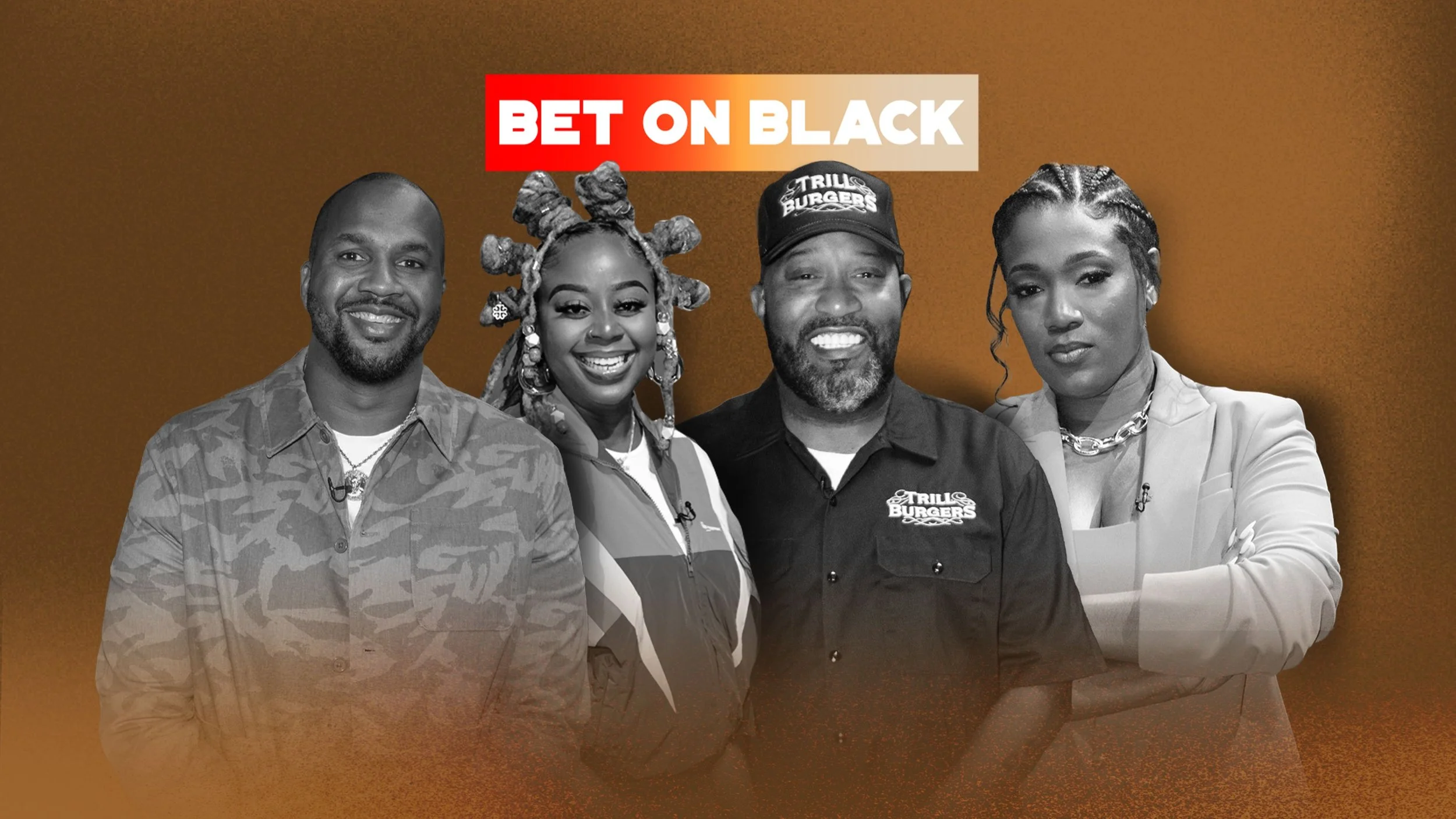
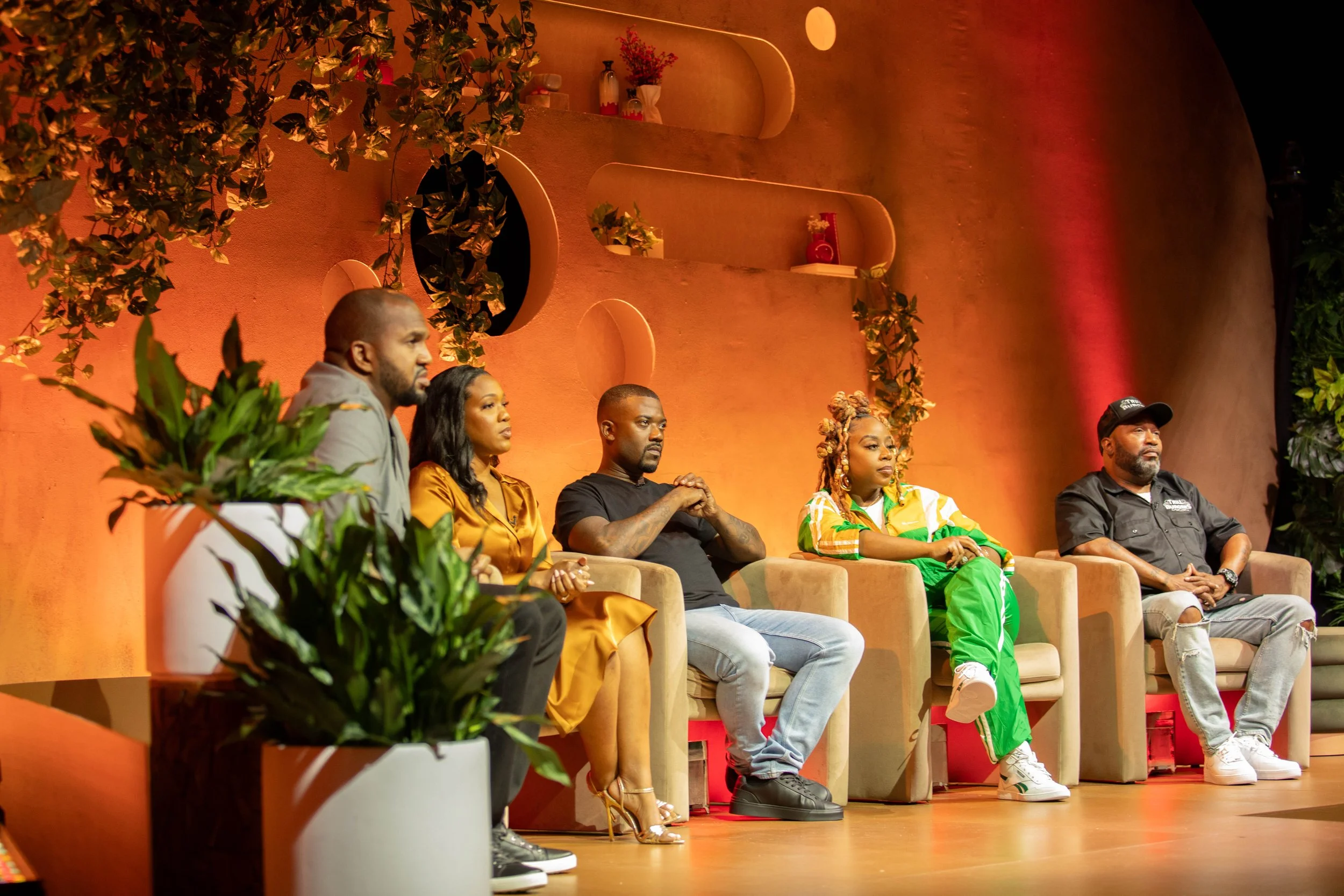
A pitch-style show that blends storytelling, competition, and philanthropic impact, spotlighting the next generation of Black entrepreneurs. In this show, innovative business concepts are presented to a team of maverick investors, industry pioneers, and cultural tastemakers, offering a platform for rising entrepreneurs to share their vision and make a lasting impact.
THE IDEA
Branding Toolkit
Successfully provided guidance on integrating the visual identities of Revolt Media, Target’s namesake brand, and Target’s Black Beyond Measure brand, ensuring a seamless and cohesive brand presence across all platforms by commanding attention through strategic use of color, movement, and typography.
COLOR PALETTE
Crafted a dynamic color palette that blended the rich, culturally resonant tones of Target’s Black Beyond Measure brand with two bold, expressive new colors, creating a vibrant and cohesive visual identity.

GRADIENT
Introduced a gradient that effortlessly merges the two expressive colors with a soft neutral from Target’s Black Beyond Measure brand, producing a smooth, visually captivating transition that elevates the brand's depth and visual impact.

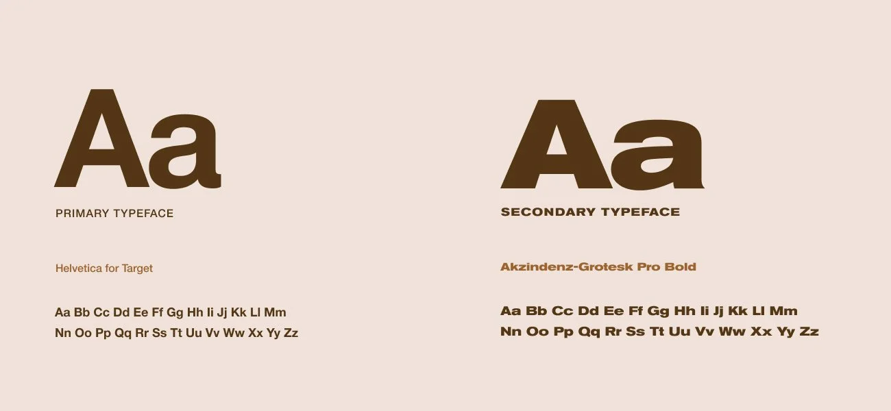
TYPOGRAPHY
We combined Target's iconic Helvetica brand font with Revolt’s corporate typeface, Akzidenz-Grotesk Pro, to create a harmonious blend of timeless simplicity and modern sophistication, delivering a sleek and contemporary edge to the overall design.
LOGO
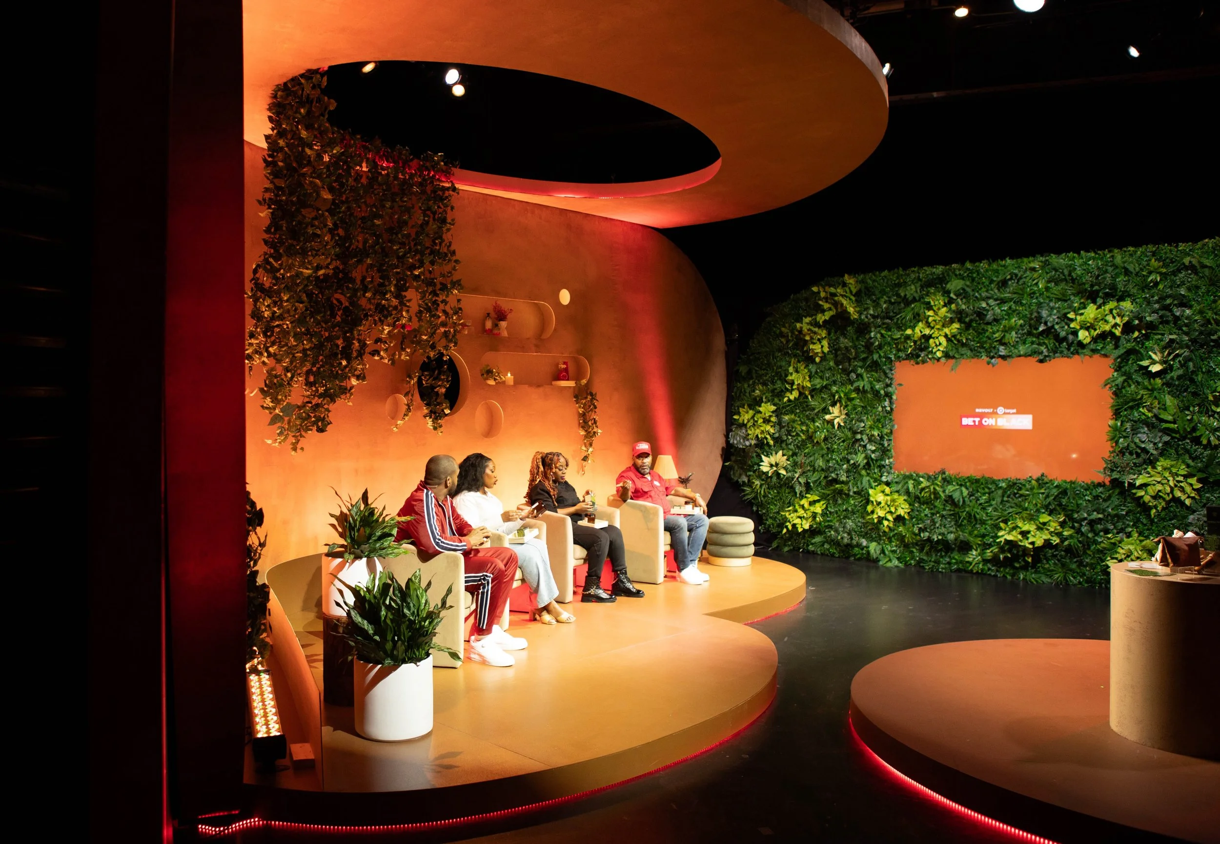
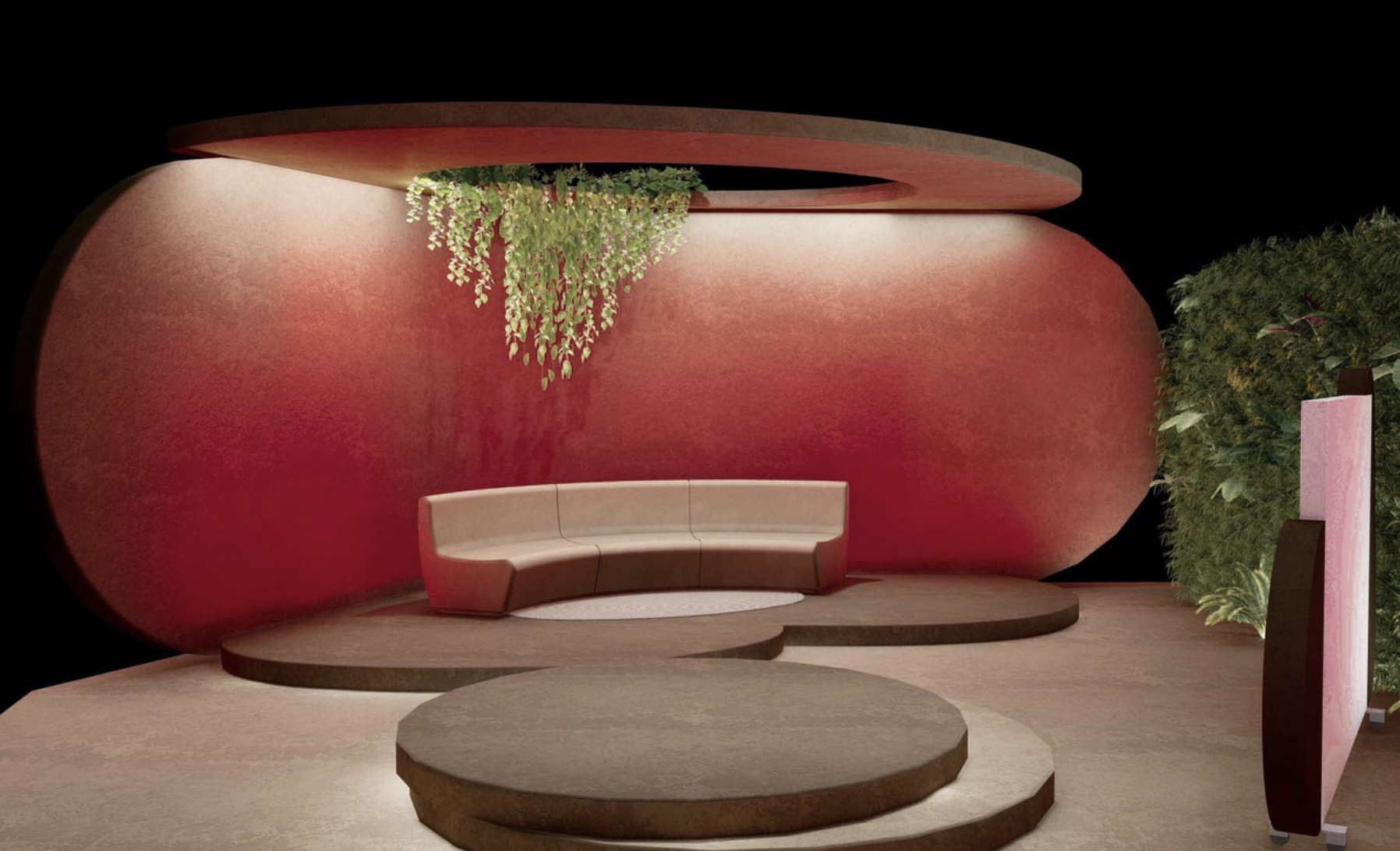
Set Design
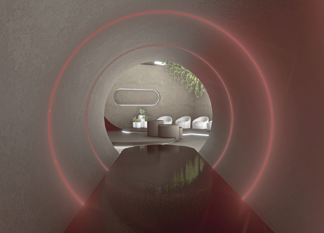
While refining the graphics package, I simultaneously collaborated with architectural designer Arthur King to evolve the set design from Season 1. I contributed creative direction and inspiration, drawing from the brands' identities and highlighting innovative aesthetic elements that reflected their core values. Once the design vision was finalized, I curated a "shoppable" selection of furniture and props from Target’s assortment, ensuring the set not only aligned with the brands but also featured products readily available to consumers.
Design, renderings, and execution by Arthur King.
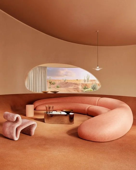
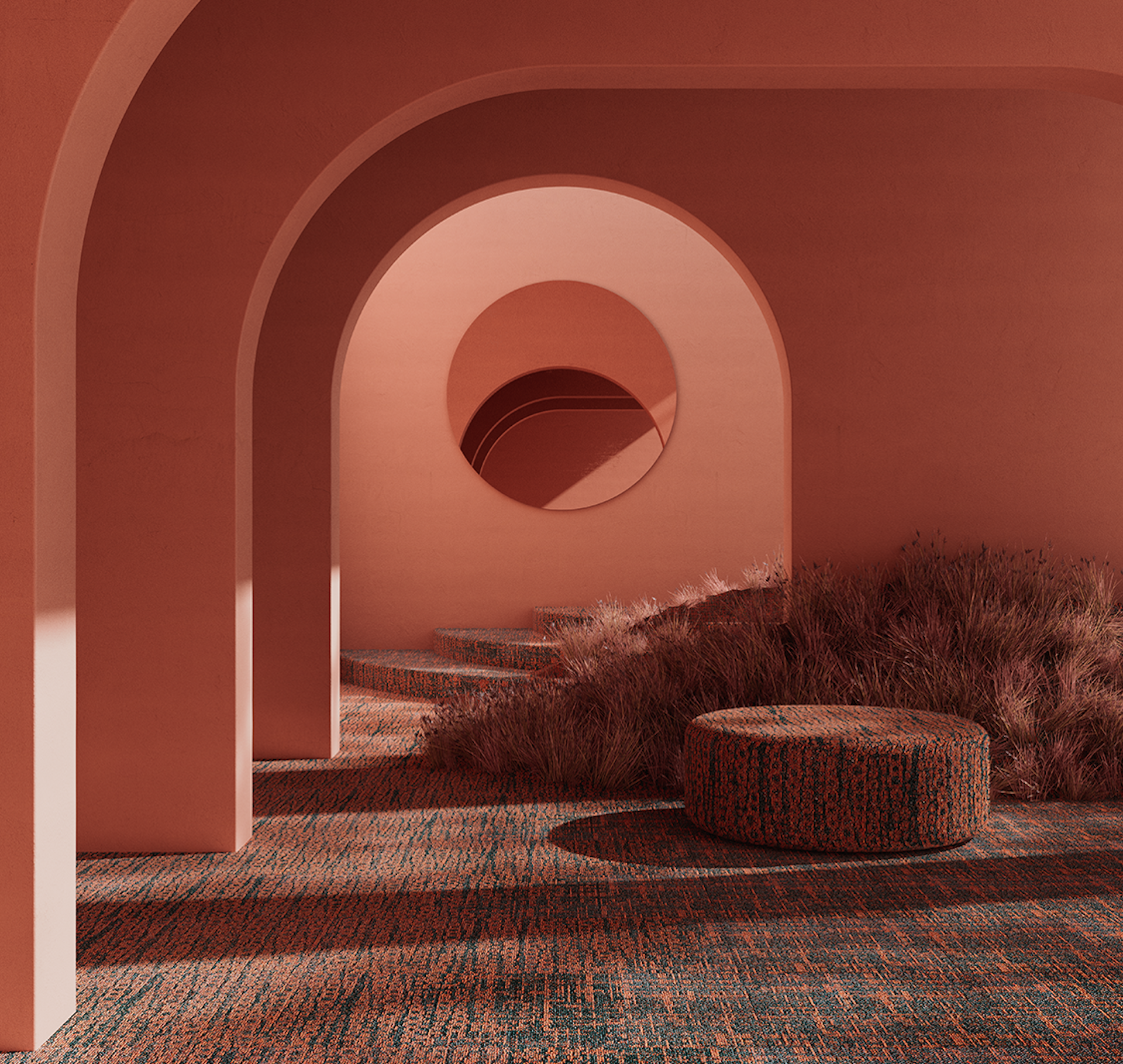
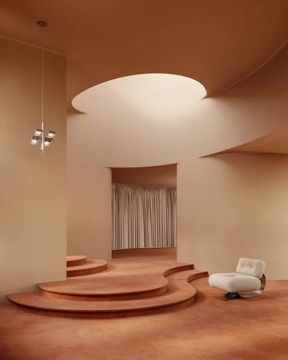
INSPIRATION
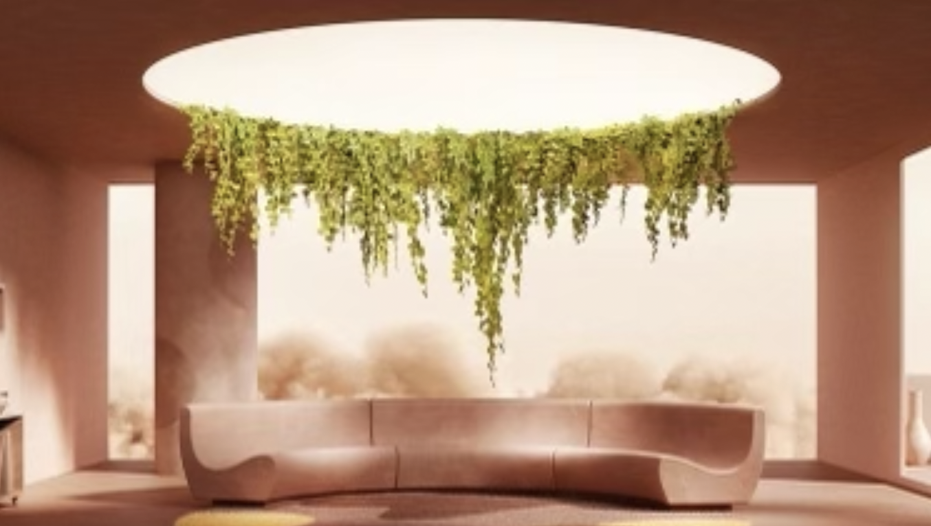
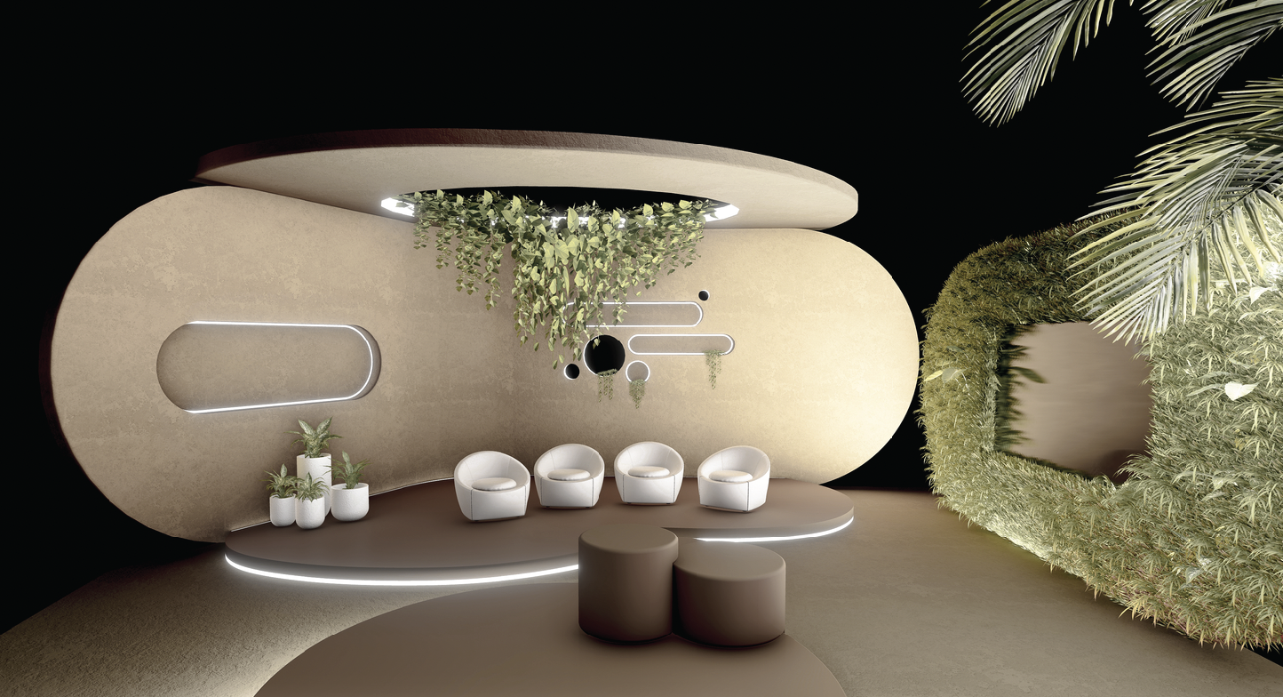
RENDERINGS

FINAL SET
Selection of In-show Graphics
Directed and refined in-show packaging assets, including animations, co-branded logo lock-ups, lower-thirds, in-episode graphics, transitions, and end credits, delivering a polished and unified visual experience.